Featured How to Design a Stand-Out Logo for Your Business.jpg

How to Design a Stand-Out Logo for Your Business

Building a website for your business is an essential step toward establishing an online presence for your business. And, luckily, you don’t have to pay an arm and a leg to get your website professionally designed.

With Websites 360®, building a DIY website is easy enough for anyone, even small business owners who have little to no experience with web design.

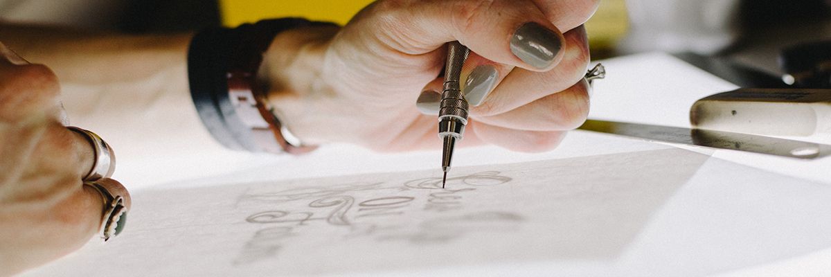
Before you start building your own website, there are a number of steps you should take. These steps include identifying the goal of your website, identifying your target audience and figuring out your budget, just to name a few. But one of the most important steps is designing the right logo for your business.

Your logo says a lot about your brand, and it will eventually be the most recognizable aspect of your business. Consequently, it should also be on every page of your website, which is why it’s important to design the right logo for your business before you start building your site.

5 tips for designing a stand-out logo

logo-design1.jpg

#1. Figure out your brand’s identity

An effective logo design is one that captures the identity of the brand in question. So, before you start taking a stab at designing a logo for your business, it’s imperative that you understand what its identity is. When you have a clear understanding of your business’s identity, it’ll be easier for you to make design choices that represent and compliment it.

Here are a few questions that you can ask yourself to help you determine your brand’s identity:

  • Why do you do what you do? In other words, what is the mission of your business?
  • What makes your business unique?
  • What makes your business stand out compared to others in your industry?
  • If you only had a few words to describe your business, what would they be?
logo-design-2.jpg

#2. See what your competitors are doing

Sometimes, even if you’re well aware of what your brand’s identity is, it’s not always easy to find the inspiration you need to design a logo. Getting started is often the hardest part of the process, and one great place to start finding inspiration for your logo is by looking at what your competitors are doing.

Don’t get me wrong. I’m not saying that you should copy or try to emulate one of your competitors’ logos, but it can be helpful to look at what different businesses in your industry are doing and what direction they are taking.

While researching your competitors’ logos, try to figure out what each logo says about the business and what sets your business apart from the others. This is what you’ll want to try to highlight while designing your logo.

Another reason why it’s a good idea to check out your competitors’ logos is that it allows you to more effectively make your logo stand out from the others.

Are most of your competitors’ logos black and white? If so, experimenting with a little color could make a big difference. Are most of your competitors’ logos conventional? If so, try to take a fun or an artistic approach to designing it.

logo-design3.jpg

#3. Pick a logo style that represents your brand

Before you actually sit down and start designing your logo, it will help you figure out what direction you want to go if you pick a style in advance. It’s important to remember that you’re not married to one specific style; you’re only limited by your own creativity, and mixing logo styles might be the ticket to designing a logo that represents your brand’s aesthetic effectively.

Here are a few of the most common logo styles:

  • Monogram - Is your business name long and complicated? If so, a monogram, sometimes called lettermark, logo might be the way to go. These logos are made up of a company’s initials; think HBO, CNN, IBM, etc.
  • Wordmark - A wordmark, also called a logotype, is a type of logo made solely up of the business’s name. A few examples of wordmarks include the logos for Google, Coca-Cola, Visa, Disney, etc.
  • Pictorial Mark - Is there a specific symbol that perfectly encapsulates your business? If so, then a pictorial mark might be a great option for you. Also called a logo symbol or a graphics-based logo, a pictorial mark is a logo that consists of only an image. A few iconic pictorial marks include the logos for Apple, Target and Twitter.
  • Mascot Logo - Some businesses choose to represent themselves with a mascot logo, which involves an illustrated mascot. A few examples include KFC’s Colonel Sanders, Planter’s Mr. Peanut and Pillsbury’s Doughboy.
logo-design4.jpg

#4. Choose color wisely

Color is something you’ll want to consider carefully when designing your logo. Not only can color make a huge difference in how your logo looks, but color also can create emotional responses in people.

The psychology of color can get complicated, but here’s a quick rundown of the most common colors and the emotions they evoke:

  • Blue - Blue is a classic choice that helps to calm and soothe, and it symbolizes maturity and trustworthiness.
  • Green - Green is the ideal color if you’re looking to establish a connection to nature; however, it’s also associated with tranquility and health.
  • Red - Red is commonly used by fast-food chains because it encourages appetite and establishes a sense of urgency.
  • Yellow - Yellow is associated with optimism and cheerfulness, but be careful. When used too much, it can create feelings of anxiety.
logo-design5.jpg

#5. Find the right typography.

The typography — or the font — of your logo says a lot about your business, which is why it’s so important to choose the right font for your needs. The typography sets the stage for the style of the logo.

Here are the basic font types you could choose from for your logo:

  • Script fonts - Script fonts are made to look like handwriting, and they can give your logo a unique, homegrown feel.
  • Serif fonts - Serifs are tiny feet at the end of each letter, and they add a classic, old-fashioned look to your logo.
  • Sans Serif fonts - These are similar to serif fonts, except they’re missing the tiny feet at the end of each letter, which makes them ideal for brands shooting for a more modern look.
  • Display fonts - Display fonts are designed to catch the eye and are highly stylized.

Your logo should be displayed on every page of your website, so before you start building your own website with Websites 360, it’s a good idea to design one that’s effective.

Need help getting your logo right? Learn how the creative team at Marketing 360® can help you design the perfect logo for your business and your website.

Originally published 2/11/20