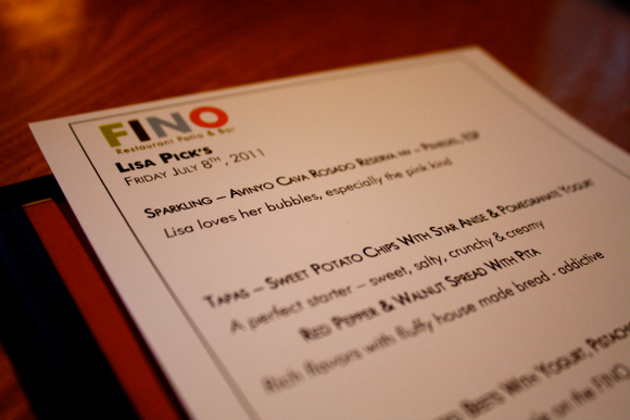
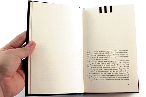
Whether you know the formal definition or not, we all know typography. It is around us every day on street signs, restaurant menus, books and more.
Quite simply, typography is the style and appearance of words and letters.

Jennifer Glasgow
Whether you know the formal definition or not, we all know typography. It is around us every day on street signs, restaurant menus, books and more.
Quite simply, typography is the style and appearance of words and letters.

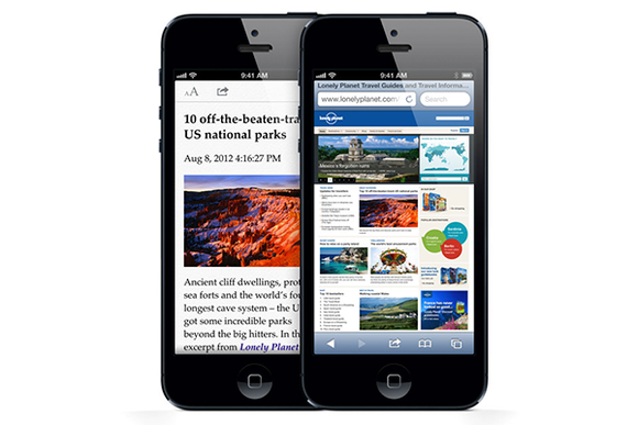
What about digital typography? You see words and letters when you type an email, read an ebook, use an app on your smartphone or visit a web page.
Digital typography is still the style and appearance of words and letters - only designed with a screen in mind.

What this means for us, or more specifically, for our website and its visitors, is that we have to make a few key decisions before we even start.

There are more fonts in this world than people. Ok, that might be a slight exaggeration but if you've ever tried to choose a font for an invitation or a logo, you know it certainly feels that way.
The truth is, fonts are so numerous because designers are constantly inventing new ones or altering the existing font families. While we would have a hard time cataloging all fonts, we can at least narrow them down in to a few categories:
Here are a few examples so you can see the difference.
I could go on for several days about what makes a typeface a serif font and what is considered a display font, etc. Instead I thought I'd share this fun video on the history of typography because everyone loves movie time!
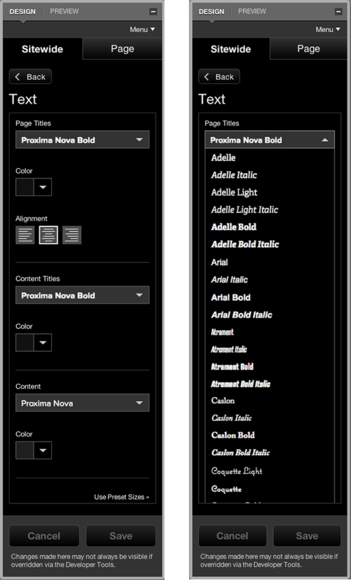
Now that we know what makes up a type family and the different categories of type, we can start to choose some for our site.
A good design rule of thumb is to choose no more than THREE fonts for your entire site. That means that all of our titles and content can be the same font family or we can mix it up and have one font for our page titles and another for our paragraph content.
The Websites 360® tool makes it easy to choose these by simply moving in to design mode and scrolling through the font options provided to us by TypeKit.
Having trouble narrowing it down with all of those choices? Maybe this will help:
Guidelines for Selecting a Typeface
Don't worry if you have trouble deciding at first; it is a decision that designers contemplate daily and even the most seasoned of us can be stumped at times.
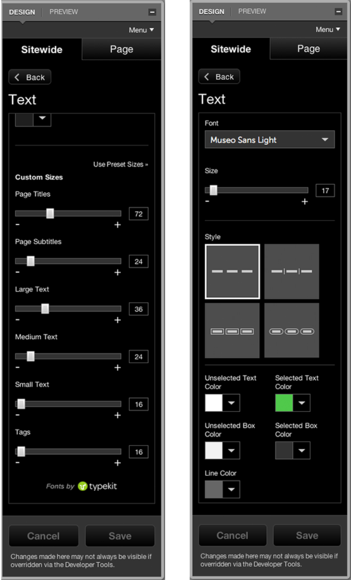
Once we've picked our fonts, the rest is a breeze. All we have to do is decide on size and color.
Sizes are subject to personal preference but there are a few standard guidelines we can follow.
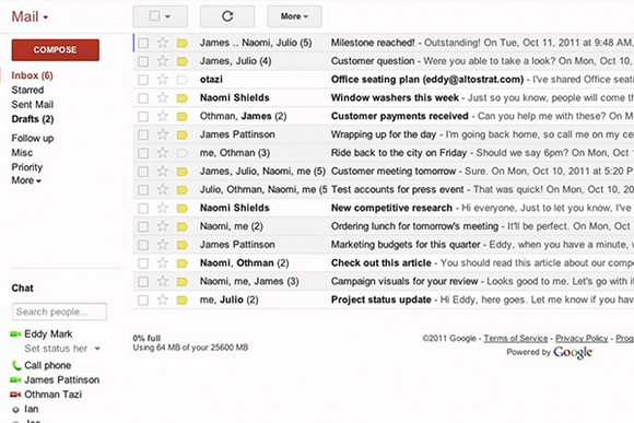
Next we can add color, remembering to be especially conservative with colors on content we want users to be able to easily read. For example, reading a paragraph of neon green text on a white background is no easy feat.
Most times text color on the web is used to highlight information, hyperlinks or to show what page you are currently on.
Take a look at Happy Hemp's website. Click through the different pages on their navigation. See how the text of the page you are on turns green? Subtle, right? Sometimes subtle is all you need to make a difference.
While the options of color on your website are endless, here are a few guidelines on text color:
We learned a little today about the history of typography and how font size and color can effect the user's comfort in reading content on your site. But all of this is just the tip of the typography iceberg.
Keep an eye on our Websites 360® blog series and we will keep diving deeper into the world of typography.
In the meantime, have fun choosing your fonts and remember the only mistake you can really make is using Comic Sans.